

The United States vary widely in geographical size and distance which makes mapping tricky in regards to visual best practices. These tips will help guide you in choosing the best path forward for your map.
Contents: (Click to Jump to)
To Start: Review the different types of basic maps.
Step 1: Consider hex-tile maps as an upgrade from having to separate
choropleth maps.
Step 3: Remove map layers for transparency.
Step 4: Separate and rescale parts of your map.
Step 5: Combine them together on a dashboard.
There a handful of basic maps that you can chose from including:
- Choropleth (Filled or shaded map)
- Hex-Tile (Similar to a choropleth map but uses hexagons instead of geographic shape.)
- Point
- Bubble
- Density
Scroll through the workbook tabs below to view the advantages of
different maps.
For the tips below, we are going to stick with choropleth maps (filled or
shaded maps) as they are the most popular type of map
visualization.
Hex-tile maps are highly recommended by data viz experts because they are a solid
workaround for a common problem in visualizing choropleth data equally
- especially in respect to smaller New England states and Alaska. The
fundamental issue we face in mapping the United States is that the size and
distance of our states and territories are playing a role in the
visualization when they should not. The workaround is to make the land-size
equal so the color of the measures are better represented. This is a great
use case for hex-tile maps!

Bonus:
A hex-tile map is created by generating our own X and Y axes and plotting our
placement of the states and territories with these X, Y coordinates.
Hexagons are used as the shape to better capture the "corners" of our
country. Squares or circles will work, but they don't look as
lovely. Also, notice how Alaska, Hawaii, and Washington, D.C. are separate? We can
also easily represent Puerto Rico and other US territories data in the lower
part of map as well.
Not ready to embrace hex-tile maps yet? No worries! We can still choose a
traditional map view.
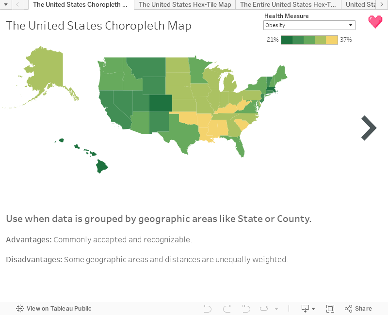
For these examples, we will be working with Tableau's handy Obesity data
source located in the Regional Sample Workbook with a few tweaks. (Download it here.)
Below is a choropleth map of the United States including Alaska and
Hawaii.

We can easily see Alaska, as well as the other larger states, but what
about Connecticut or Rhode Island? Due to their small geographic size,
they are muffled in this representation. The best way to fix this is to
create separate and rescaled maps to standardize the different sizes and
distances from the other states.
Step 2: Decide if filtering out the states makes
sense. (Hint: Usually it doesn't, so you can skip to
Step 3.)
If your data is continuously updated or you use a parameter to toggle
measures, this is not a wise decision.
However, if the min and max value of the data is static, and you are not
using a parameter to switch measures on color, filtering out these states
can be a good idea.
The reason for this caveat is that we have to lock the color legend in the
Advanced settings to continue to represent the correct color range. This
means we include a Start and End value for the color range. Since these
values have to be hardcoded, it typically only makes sense for one measure.
Furthermore, if your data is frequently updated, this step will need to be
done manually any time there is an update to the min or max value. This is
quite cumbersome.
Let's review an example:
Check out Alaska's Obesity percentage value and color. It is 31% and green.
(Remember this.)

Now duplicate this worksheet and then filter to only include
Alaska.
Remember above how Alaska's value of 31% Obesity was green?

Oh no! Alaska is now yellow instead of green. This is because when we
filter to only include Alaska, we lose the color gradient and just have
one data point for the range. If we add this filtered map of Alaska
along side the contiguous United States, the color will not be
representative of the value range and our visualization will be
wrong.
To fix this, we manually lock the Start and End value of the Color
range to the min value and max value of our single measure of Obesity,
which is 21% and 37%, respectfully.
Marks Box > Color > Edit Colors > Advanced

Fixed it!

Note that we hardcoded our Start and End values. If we use a parameter to
toggle the measure color, the min and max will not be dynamic to the ranges of separate
measures.
To make the map nice and tidy, we remove all map layers. This will
give us a pleasant white background and allow transparency for the
maps. This is a must-have for good floating placement in Step 5. Go
to Map > Map Layers. Then unselect all options on the left.


In this example we will create a separate and rescaled map for Alaska
and Hawaii to float on a dashboard with the contiguous United
States.
The first step is to duplicate the map two times.
Next either zoom into the contiguous United States or, if you
have static data and only one measure on color, filter out Alaska
and Hawaii.
After that, unselect all of the Map Options so users cannot adjust
your map. Or better yet, accidentally zoom in when they are using a
mouse to scroll down the dashboard - which is a common frustration
many viewers experience.

Watch a demonstration of how to separate and rescale:
Recall in Step 3 when we removed all map
layers? This is where it pays off! If you missed this step, you'll want to
do it now. Removing the map layers will provide us with a transparent
worksheet to float on the dashboard. This gives us a lot more options on
placement.

Comments
Post a Comment
Leave a reply