
Drilldown analytics is a best practice in Tableau. But, what about drilling
into locations on a map? Now, with a blend of set actions and parameter
actions, we can! This step-by-step guide will show you how to create a
drilldown map of the United States that goes from Region to State to County -
and back up again!
Contents: (Click to Jump to)
Step 1: Create regions.
Step 2: Use a set to drill down from regions to state.
Step 3: Create a parameter and logic to drill down to county.
Step 4: Format your maps and place them on a dashboard.
Step 5: Fix null color legends.
Step 6: Implement dashboard actions to drill down.
Step 7: Develop breadcrumbs to drill back up.
Step 8: Establish comparisons through level of detail
calculations.
Step 9: Use tooltips to beautifully enhance your data story.
This step-by-step guide builds on top of Tableau Zen Master Andy Kriebel's video Region to State Drill Down with Set Actions. For county-level data, we are using Tableau's sample "Obesity" data source from the
"Regional" sample workbook available for download on Tableau Desktop's
Start Page.
You may also download the completed workbook below:
If your data does not contain county-level data, but has city or
postal code detail, simply replace the county-level worksheet with
the level of detail you have available. Feel free to contact me if you have any questions.
The first step is to change the Region field into a Geographic
Role.
If you do not have a Region field in your data, you can simply
create this field by using an IF/THEN or CASE() statement.
Click on Region > Geographic Role > Created From >
State

Next, drag [Region] to Detail on the Marks box (or simply
double click) to display a map of regions. Place your measure
on color.
Tip: If you hold the right mouse button instead of the left
mouse button when you select and drop the measure, a window will
pop up that allows you to choose the aggregation of the
measure.
 For this example, we are using [Health Measure Selected] which is
a calculation driven by a parameter for users to choose different
health statistics in the United States.
Watch the video of Step 1:
For this example, we are using [Health Measure Selected] which is
a calculation driven by a parameter for users to choose different
health statistics in the United States.
Watch the video of Step 1:
When a user clicks on the map, we want to expand the selected
[Region] into [State] but not expand the other regions. To
accomplish this, we will implement a Set Action. For this, we
first need to generate a Set from [Region].
Click on the dropdown arrow on [Region] > Create >
Set. Name the field "Region Selected" and click OK.
 The next step is to create logic to expand to [State] when
[Region Selected] is activated.
Create a calculation named “Drill to State”.
Copy and paste the code below into the calculation box:
IF [Region Selected] THEN [State] END
The next step is to create logic to expand to [State] when
[Region Selected] is activated.
Create a calculation named “Drill to State”.
Copy and paste the code below into the calculation box:
IF [Region Selected] THEN [State] END
 Assign this calculation a Geographic Role > Create from >
Region
Assign this calculation a Geographic Role > Create from >
Region
 This logic will return [State] values when a Region is selected
from the set [Region Selected].
Place [Drill to State] on Detail in the Marks Box.
This logic will return [State] values when a Region is selected
from the set [Region Selected].
Place [Drill to State] on Detail in the Marks Box.
 Watch the video of Step 2:
To drill into county, we will implement a parameter action that
toggles between the US Map view with [Region] and [State] to the selected [State]
[County].
First, let's create our County-level worksheet.
 Create a new worksheet and double click on [County] to create
your map. Next, drop your measure on color.
Name this worksheet "County-level".
The next step is to create a parameter from [State]. Click on
[State] > Create > Parameter.
Create a new worksheet and double click on [County] to create
your map. Next, drop your measure on color.
Name this worksheet "County-level".
The next step is to create a parameter from [State]. Click on
[State] > Create > Parameter.
 Name the parameter “State (For County)” and add a value “US Map”
to the list of States and type the Display As “the United States”
to use for dashboard title formatting in Step 4.
Name the parameter “State (For County)” and add a value “US Map”
to the list of States and type the Display As “the United States”
to use for dashboard title formatting in Step 4.
 Now we create the parameter logic to seamlessly toggle between
our maps.
Create a calculation named “County Map Pop-Up Logic".
Copy and paste the code below into the calculation box:
IF [State (For County)] = [State] THEN "Show County-Level Map"
ELSEIF [State (For County)] = "US Map" "Show Region/State Map"
END
Now we create the parameter logic to seamlessly toggle between
our maps.
Create a calculation named “County Map Pop-Up Logic".
Copy and paste the code below into the calculation box:
IF [State (For County)] = [State] THEN "Show County-Level Map"
ELSEIF [State (For County)] = "US Map" "Show Region/State Map"
END
 On the County Worksheet, right click on the [State(For County)]
parameter and select “Show Parameter Control”. (Select a [State]
value if there is no data populated.) Place the [County Map Pop
Logic] Calculation in the Filters box.
Select “Show County-Level Map” and click OK.
On the County Worksheet, right click on the [State(For County)]
parameter and select “Show Parameter Control”. (Select a [State]
value if there is no data populated.) Place the [County Map Pop
Logic] Calculation in the Filters box.
Select “Show County-Level Map” and click OK.
 On the US Map with [Region] and [State] worksheet(s), right
click on the [State(For County)] parameter and select “Show
Parameter Control”. Select “the United States”. Place the [County Map Pop Logic] calculation in the
Filters box.
Select “Show Region/State Map”
Select OK.
On the US Map with [Region] and [State] worksheet(s), right
click on the [State(For County)] parameter and select “Show
Parameter Control”. Select “the United States”. Place the [County Map Pop Logic] calculation in the
Filters box.
Select “Show Region/State Map”
Select OK.
 Watch the video of Step 3:
Do you have Alaska and Hawaii in your map? Visit Mapping the United States for tips!
The first step in formatting is to remove the Map Layers. If the
“State/Province Borders” option is grayed out, zoom into the
United States to prompt it to appear.
Next, we will remove the worksheet shading, row borders, and
column borders. If you have Alaska and Hawaii, duplicate this
worksheet to save having to duplicate these steps.
For the County-level map, we must toggle the [State (For County)]
parameter to a [State] value to see data. Repeat the above steps
of removing Map Layers.
Tip: If you are missing some counties in your data, you may
choose to leave on some Map Layers. (For example, "Base" and
"Streets, Highways, Routes" as shown below.)

Right click on one of the previous worksheet tabs to find and
select "Copy Formatting". Go to the County-level worksheet,
right click and select "Paste Formatting" to automatically
remove the shading and borders we did in the above step. This
wonderful shortcut saves us some clicking in manually removing the shading and borders.
Next, we remove the Map Options from these maps. This is a good
practice so users do not accidentally zoom into a map with
their mouse scroll or unlock the focused zoom of our Alaska
or Hawaii
maps. Be sure that the map is populated (you may need to toggle
the [State (For County)] parameter) to remove all available
choices for Map Options.
Watch the video of formatting your maps:
Now, it's time to create our dashboard.
Tip: I rarely recommend to publish with automatic as a
dashboard size - Especially if you're planning to float objects.
I usually have a fixed size or set a range for the dashboard
size. For now, I'm using a custom fixed size that will be embedded into
this blog post. Also, know your audience and develop for multiple layouts. It is
a good idea to add mobile layouts as well.
Select "New Dashboard" and drag a Vertical container from Objects
in the lower left to place on the dashboard. Next, drag the US Map
worksheet (here we have named it the "Contiguous US") and then
also drag the County-level worksheet so they are both in the
Vertical container. This is required to swap the views with
the [State (For County)] parameter.
The next step is to add Alaska and Hawaii. You may choose to use a completely Tiled layout, but
I prefer
floating as I can precisely control the size and placement of the
worksheets.
To float, place a Blank on the left side of the dashboard so we can put
Alaska and Hawaii in this space. The reason we require the blank is so when the County-level
worksheet is populated, let's say to Montana, we can still hover
over all of the counties and see the tooltip without
the "ghost worksheets" of Alaska or Hawaii obstructing the view. -- You may decide that losing visual real estate for the blank is a good reason to use a tiled layout with collapsing containers instead of floating Alaska and Hawaii. --
The blue boxes are where Alaska and Hawaii would be floating if
we did not add the blank:
 Now, let's toggle the parameter from "the United States" to any
[State] value.
Now, let's toggle the parameter from "the United States" to any
[State] value.
 Uh oh! Notice how our color legend switches to "Null"?
No worries! We will fix this in Step 5, but for now, let's delete that container that has the
color legend and the parameter.
Uh oh! Notice how our color legend switches to "Null"?
No worries! We will fix this in Step 5, but for now, let's delete that container that has the
color legend and the parameter.
 Watch the video of creating the dashboard:
To fix the issue of the differing color legends, we will create
a separate worksheet to go on the dashboard that has a
calculation to switch the color legend from State measure values
to County measure values using the [State (For County)]
parameter. We hide this worksheet on the dashboard, but display
its color legend.
First, create a new worksheet.
Create a calculation named “Color Legend Logic”.
Copy and paste the code below into the calculation box:
IF [State (For County)] = [State] THEN [County]
ELSEIF [State (For County)] = "US Map" THEN [State]
END
 Place the calculation on Rows and drag your measure on color.
Name this worksheet “Color Legend”.
Place the calculation on Rows and drag your measure on color.
Name this worksheet “Color Legend”.
The next step is to add this worksheet's color legend to the
dashboard and hide it. To do this, float the "Color Legend"
worksheet, deselect "Show Title" and set the Position at -1,-1 and
the Size at 1x1. You may choose to float or tile the color legend.
 Watch the video of Step 5:
This is where we start to develop the drilldown interaction! To
accomplish this, we create two dashboard actions.
First we create a Set Action that is sourced from our
Region-level worksheet maps: "Alaska", "Contiguous US", and
"Hawaii".
When a user interacts with these worksheets, they will trigger
the Action for the Set. This Set Action is designed to expand from
[Region] to [State] via the [Region Selected] calculation we made earlier.
Next, drag [Region] to Detail on the Marks box (or simply double click) to display a map of regions. Place your measure on color.
We also want to "Remove all values from set" if the selection is cleared.
(This is be more apparent in Step 7.)
 Next we create the Parameter Action. Again, we want our
Region-level worksheet maps: "Alaska", "Contiguous US", and "Hawaii" to be the Source
Sheets.
When a user interacts with these worksheets, they will prompt the
"County-level" worksheet to appear and the Region-level (US Map)
worksheets to collapse in the Vertical Container by having the [State (For County)] parameter to adopt the value
of the [Drill to State] calculation we made earlier.
Next we create the Parameter Action. Again, we want our
Region-level worksheet maps: "Alaska", "Contiguous US", and "Hawaii" to be the Source
Sheets.
When a user interacts with these worksheets, they will prompt the
"County-level" worksheet to appear and the Region-level (US Map)
worksheets to collapse in the Vertical Container by having the [State (For County)] parameter to adopt the value
of the [Drill to State] calculation we made earlier.
 Watch the video of Step 6 and to see the drilldown in action:
As we can see from the video of Step 6 above, we are perfectly able to drill down. But, what about going back up? To accomplish drilling up, we
will create two worksheets to act as breadcrumbs to allow the user to
return to a previous level of detail.
Watch the video of Step 6 and to see the drilldown in action:
As we can see from the video of Step 6 above, we are perfectly able to drill down. But, what about going back up? To accomplish drilling up, we
will create two worksheets to act as breadcrumbs to allow the user to
return to a previous level of detail.
The first breadcrumb worksheet we will create is to completely reset the
view.
Go to the dashboard and expand a Region.
If you have expanded to the County-level, show the parameter control for
[State (For County)] and switch the value to "the United States".
In the example below, we have expanded the West Region.
 Next, we create a new worksheet.
Place the [Region Selected] set on the Rows.
Place [Region] on the Rows.
Hide "Out" values of [Region Selected] for the breadcrumb to only
display after a user clicks on the map to expand a region.
Now we create a calculation of the string "US Map".
Create a calculation named "US Map".
Copy and paste the code below into the calculation box:
"US Map"

Place this calculation on Text in the Marks box.
Put State (For County)] on Detail in the Marks box.
The Set Action filter we create requires two clicks: one to
activate it and another to implement it. Type "Double Click Here to
Reset Map View" for the text on the label and "Double Click to Reset Map
View" on the tooltip.
Format to your liking.
Tip: If your tooltips are purely informative, unselect the "Include
command buttons" and "Allow selection by category" options in the
Edit Tooltip box.
Name this worksheet "Reset View".
Watch the video of creating the "Reset View" breadcrumb:
Now we create another worksheet to act as the breadcrumb for a user to go
back to the Expanded Region view.
Create a calculation named "Showing Counties".
This is a boolean that will help us with the breadcrumb logic.
Copy and paste the code below into the calculation box:
[State (For County)] <> "US Map"

Create a calculation named "Return to ".
This is dynamic text for the tooltip that will only populate if the user has drilled down
into State.
Copy and paste the code below into the calculation box:
IIF([Showing Counties], "Return to ","")

Create a calculation named "State Selected".
Copy and paste the code below into the calculation box:
IIF([Showing Counties], " > " + [State (For County)], "")
 Place [Showing Counties] in the Filters box and select
“True”.
Place [Showing Counties] in the Filters box and select
“True”.
Note: You will need to toggle the [State (For County)] parameter to a
State that is in your Selected Regions from the dashboard for this
portion. For example, if the West Region is selected, you may choose
California for this step.
Drag ["US Map"] in the Rows and duplicate this field to place on Text in the Marks box.
Tip: Holding <Ctrl> while selecting, dragging, and dropping a field with your mouse
duplicates the field.
Place [Region Selected] into Detail and change to “Show members in Set”
from the field’s dropdown.
Next drag [Region] and [State Selected] into the Text box. This is so the selected state can also be
displayed in the breadcrumb.
Create text for the first breadcrumb.
Copy and Paste the code below into the Text Label window:
> <"US Map"> with <Region> Expanded <State Selected>
 Create a tooltip for the second breadcrumb.
Drag ["Return to "] into Tooltip in the Marks box.
Copy and Paste the code below into the Edit Tooltip window:
<ATTR("Return to ")><"US Map"> with <Region> Expanded
Create a tooltip for the second breadcrumb.
Drag ["Return to "] into Tooltip in the Marks box.
Copy and Paste the code below into the Edit Tooltip window:
<ATTR("Return to ")><"US Map"> with <Region> Expanded
 Name this worksheet "Return to Region Expanded".
Watch the video of creating the "Return to Region Expanded"
breadcrumb:
Next we add the breadcrumbs to the dashboard above the placement of
the maps.
Name this worksheet "Return to Region Expanded".
Watch the video of creating the "Return to Region Expanded"
breadcrumb:
Next we add the breadcrumbs to the dashboard above the placement of
the maps.
I prefer to float these to control the pixel size and position, but you
may prefer a tiled layout.
Be sure that the font color and size of the label and the tooltips match
for the breadcrumbs! Select "Entire View" for the breadcrumb
worksheets.
Note: In the video the y-axis position on the dashboard for the
floating breadcrumbs is 81. I have since changed it to 77.
Watch the video of creating our breadcrumbs to the dashboard:
Tip: When we add new worksheets to the dashboard, they
may be automatically added to the present Dashboard Actions. Before we create the new actions, we need to edit and confirm
that new worksheets are deselected from incorrect Actions.
Watch the video of deselecting worksheets from incorrect Actions:
To complete the drillup from the breadcrumbs, we create dashboard
actions.
The first breadcrumb action is designed to go from the County-level view
to the Expanded Region view when "Return to Region Expanded" is
clicked.
We accomplish this by creating a Change Parameter Action that is sourced from the "Return to Region Expanded"
worksheet. It replaces the [State (For County)] parameter's [State] value
to "US Map". Name this action "Go Back to Region Expanded".

The second breadcrumb action is very similar to the first breadcrumb
action, but is designed to go to the Expanded Region view when "Double
Click Here to Reset Map View is" is clicked when on the County-level
worksheet. The only difference is the source sheet is "Reset View".

The final breadcrumb action is a Set Action that will reset the
[Region Selected] set back to none so the US Map view is
completely regional. The source sheet is "Reset View" and we want to "Remove all
values from set".
 Watch the video of creating the breadcrumb Dashboard Actions:
Now that our dashboard is functioning properly, let's look at adding some
comparisons for our tooltips. We have visuals that represent three
different levels of detail:
1. Regional view. Regions should be compared to the national
average.
2. Region expanded view. The regions showing states should be compared to
that region’s average.
3. County-level view. These counties should be compared to the state
average.
The first two will look at whether the [Region Selected] set is
expanded and will toggle which measure to use for
calculations. Please note there is no date component to this data. If your data has a
date field, this will likely need to be included in the level of
detail (LOD).
Create a calculation named "National Health Measure".
The national average is the highest level of detail in the data. This is
an LOD locked at the overall average.
Copy and paste the code below into the calculation box:
{AVG([Health Measure Selected])}

Create a Calculation named "Regional Health Measure".
This locks the calculation at the [Region] level.
Copy and paste the code below into the calculation box:
{FIXED [Region]: AVG([Health Measure Selected])}

Create a calculation named "State Health Measure".
This locks the calculation at the [State] level.
Copy and paste the code below into the calculation box:
{FIXED [State]: AVG([Health Measure Selected])}
 Format [State Health Measure] as a percentage with no decimal
places.
Format [State Health Measure] as a percentage with no decimal
places.


Create a calculation named "County Health Measure".
This locks the calculation at the [County] level. Since we
are only looking at one state at a time, we don’t have to
lock the calculation at the [State], [County] level in this
calculation. If we were to look at county across multiple
states, we’d want to add [State] into the LOD as the same
county name can exist in multiple states.
Copy and paste the code below into the calculation
box:
{FIXED [County]: AVG([Health Measure Selected])}

Create a calculation named "Regional or National
Health Measure".
This is a calculation that toggles whether to use the
national or regional calculation for our measure. It
states that if a region is expanded to the state level
via the set action, use the regional rate; otherwise use
the national rate for comparison at the regional level.
Copy and paste the code below into the
calculation box:
IIF([Region Selected], [Regional Health Measure], [National Health Measure])
 Format [Regional or National Health Measure] as a
percentage with no decimal places.
Format [Regional or National Health Measure] as a
percentage with no decimal places.
Create a calculation named "Regional Difference
from National".
For this comparison, we want to find the
difference of the regional value to the national
value. To avoid rounding errors, round to the
second decimal place.
Copy and paste the code below into the
calculation box:
ROUND([Regional Health Measure],2) - ROUND([National Health Measure],2)

Create a calculation named "State
Difference from Regional".
For this comparison, we want to find the
difference of the state value to the
regional value. To avoid rounding
errors, round to the second decimal
place.
Copy and paste the code
below into the calculation
box:
ROUND([State Health
Measure],2) - ROUND([Regional Health
Measure],2)

Create a calculation named "County
Difference from State".
For this comparison, we want to find the
difference of the county value to the state
value. To avoid rounding errors, round to
the second decimal place.
Copy and paste the code below
into the calculation box:
ROUND([County Health
Measure],2) - ROUND([State Health
Measure],2)

Tip: This calculation will act as a KPI
indicator. We can create formatting
directly in the Default Properties with
the delimited sequence of: Positive; Negative; Equal
Simply copy and paste ▲ into Custom Format for negative
numbers and ▼ for positive numbers with a delimiter of ";".
We may also add an optional format for
equal conditions like "Same as" which we
have as an example below.
 Copy and paste the code below into the
custom format box:
Copy and paste the code below into the
custom format box:
0% ▲; 0% ▼; Same as
Here is another example you may use in
another use case without the arrows
filled:
△ 0% ;▽ -0% ; no change
Create a calculation named "Regional or
National Health Measure
Difference".
This calculation also looks to the set to
toggle which value to compare. If the
region is expanded to view states, we
compare the state value to the regional
value. If the region is not expanded, we
compare the region’s value to the national
value.
Copy and paste the code below into the
calculation box:
IIF([Region Selected], [State Difference from Regional], [Regional Difference from National])
 This calculation will act as a KPI
indicator.
Copy and paste the code below into the custom
format box:
This calculation will act as a KPI
indicator.
Copy and paste the code below into the custom
format box:
0% ▲; 0% ▼; Same as
Create a calculation named "
"regional" or "national" ".
This is for the verbiage of whether
the measure is "regional" or
"national" in the tooltip.
Copy and paste the code below
into the calculation box:
IIF([Region Selected], "regional", "national")

Create a calculation named "
"Click to
view" ".
This is calculation provides
dynamic text for the user to guide
them in navigating dashboard
functionality. If a region is
expanded on the map, the text
instructs to “Click the view
Counties in the [State]”
otherwise, the text will state
“Click the view States in the
[Region]".
Copy and paste the
code below into the
calculation box:
IF [Region Selected] = TRUE THEN "Click to view Counties
in " + [State]
ELSE "Click to view States
in the " + [Region]
END
 Now that we've created our
calculations, it's time to
put our tooltips to
work!
Now that we've created our
calculations, it's time to
put our tooltips to
work!
Creating elegant tooltips is an important yet commonly overlooked step in
dashboard design. Some of the elements of great tooltip design that we
will incorporate include: color, dynamic text, comparisons, and
instructions.
Be sure that all required fields are dropped on the Tooltip box or are
either already in the marks box. Parameters are automatically available
for tooltips. I usually prefer to deselect the “Include command buttons”
and “Allow selection by category” options as these tooltips are purely
informative and I don’t want users to accidentally filter out something
and not know how to undo it.
Regional Worksheets:
For these tooltips we want to display:
• Which region or state we are hovering over.
• Instructions to click to expand the region to state or to
click to view the counties.
• Comparisons of the region to nation or the comparison of
state to region if expanded.
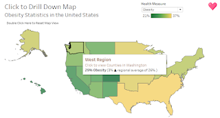
Region tooltip:
 Region expanded tooltip:
 The first step is to make sure that all the fields we need in the
tooltip are present in the Marks box for the Regional worksheets (e.g.,
US Map, Alaska, Hawaii).
The first step is to make sure that all the fields we need in the
tooltip are present in the Marks box for the Regional worksheets (e.g.,
US Map, Alaska, Hawaii).
Fields to place on the Tooltip of the Marks box include:
["Click to view"]
["regional" or "national"]
[Regional or National Health Measure Difference]
[Regional or National Health Measure]
 For all worksheets at the Region level, including Alaska and Hawaii,
copy and paste the following into the Edit Tooltip window.
<Region> Region
For all worksheets at the Region level, including Alaska and Hawaii,
copy and paste the following into the Edit Tooltip window.
<Region> Region
<ATTR("Click to view")>
<AVG(Health Measure Selected)> <Parameters.Health
Measure> (<AVG(Regional or National Health Measure
Difference)> <ATTR("regional" or "national")> average of <AVG(Regional or National Health Measure)>.)
 Tip: Tooltip fields can sometimes be finicky. If you are swapping out
fields from the Marks box and the tooltips are not properly displaying,
try opening and closing the tooltip or re-insert them from the Insert
dropdown.
Tip: Tooltip fields can sometimes be finicky. If you are swapping out
fields from the Marks box and the tooltips are not properly displaying,
try opening and closing the tooltip or re-insert them from the Insert
dropdown.
County-level Worksheet:
For these tooltips we want to display:
• Which county we are hovering over.
• Comparisons of the county to state.
 Fields to place on the Tooltip of the Marks box include:
[County Different from State]
[State Health Measure]
For the County-level worksheet, copy and paste the following into the
Edit Tooltip window.
Fields to place on the Tooltip of the Marks box include:
[County Different from State]
[State Health Measure]
For the County-level worksheet, copy and paste the following into the
Edit Tooltip window.
<State>
<County> County
<AVG(Health Measure Selected)> <Parameters.Health
Measure> (<AVG(County Difference from State)> state average of<AVG(State Health Measure)>.)
 Watch the video of Step 9:
And there you have it! You now have a complete drilldown (and
drillup) map and dashboard.
This locks the calculation at the [Region] level.
0% ▲; 0% ▼; Same as
Here is another example you may use in another use case without the arrows filled:
△ 0% ;▽ -0% ; no change
Create a calculation named "Regional or National Health Measure Difference".
This calculation also looks to the set to toggle which value to compare. If the region is expanded to view states, we compare the state value to the regional value. If the region is not expanded, we compare the region’s value to the national value.
Copy and paste the code below into the calculation box:
0% ▲; 0% ▼; Same as
<ATTR("Click to view")>
<AVG(Health Measure Selected)> <Parameters.Health Measure> (<AVG(Regional or National Health Measure Difference)> <ATTR("regional" or "national")> average of <AVG(Regional or National Health Measure)>.)
<State>
<County> County
<AVG(Health Measure Selected)> <Parameters.Health Measure> (<AVG(County Difference from State)> state average of<AVG(State Health Measure)>.)

Comments
Post a Comment
Leave a reply