
Creating dynamic units of measure formatting is a must-have for any Tableau
tips and tricks blog. However, many of these techniques are missing a critical
piece.

Contents: (Click to Jump to)
Step 1: Formulate different units of measure for KPIs.
Step 2: Create dynamic measure units for a table.
Step 3: Make your dynamic measures more insightful with color.
Step 4: Add the exact value to the tooltip for definiteness.
Which is easier to read?
$1,234,567,890.00 vs $1.2B
Being concise is imperative when making fast and informed
decisions with data. Using visualizations instead of text is usually
the best way to accomplish this. However, users still need to see
vital numbers while designers reprove clutter on the dashboard. This
is a perfect time to use dynamic units!
As mentioned above almost every Tableau tips and tricks blog covers dynamic formatting for measure units. But there is one critical piece that many miss.

Many of these dynamic KPIs do not include the absolute value function
ABS() in the conditional logic of the calculation. Not including this
function assumes that the measure will always be positive in the
data. This is not necessarily the case - especially in regards to profit or
variance calculations.
Let's look at an example. Below is dynamic formatting logic for millions
(M) units.
IF SUM([Sales]) >= 1000000 THEN "M" END
Now, suppose it is possible to have negative sales numbers. The logic of
this calculation would not recognize the value of -$1,000,000 to be
-$1M. In fact, the logic above would produce a null.
We need to safeguard against this in our calculation by using absolute value.
IF ABS(SUM([Sales])) >= 1000000 THEN "M" END
Perfect! Now we can properly change the value to the unit "M" when it is
positive or negative.
Personally, I like to keep my measure value types as numbers and not
convert them into strings if possible. This is why I prefer the multiple
calculation method with different formatting for KPIs.
Pros: No rounding or string conversions are necessary.
Cons: Multiple fields are required for
formatting different units of the same value.
Billions:

Millions:

Thousands:

Hundreds or Less:

After the units of measure calculations are created, (i.e., billions, millions, thousands, hundreds or less) we place them all on
the same line in the Text label on the Marks Box.

Note: For units of measure that are not listed by default in the Display Units (for example, metric weight in kg), go to the Suffix box in the Custom Number Format and type " kg".

You may download the completed workbook below for several different dynamic
units of measure KPIs, including currency or number, time, weight, volume,
area, and length: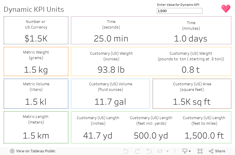
Create dynamic measure units for a table.
The above calculations are great for the KPI numbers on our dashboard,
but what about when we need to show multiple measures on a text table?
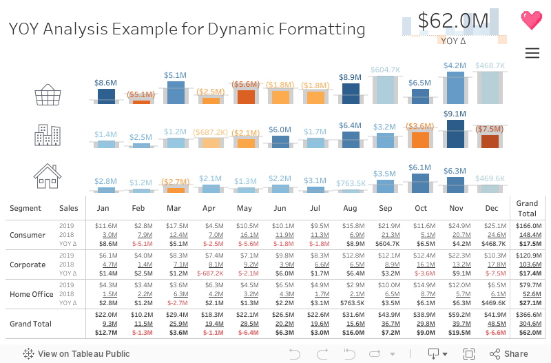
Let's say we are doing a year over year (YOY) analysis and we have
created different measures for current year, previous year, and the
delta. We cannot utilize Measure Values for this scenario and we need to
create logic that utilizes rounding, division and string conversion to place the value and
the unit of measure together.

Repeat these steps for any other measures needed in the text table.
Note: It may be possible that some of these values are null. This
means that we should create a space " " calculation to pad the line in case
there is a null.

Next, we place these calculations on in the Text label on the Marks Box.

Uh oh. Now we don't have label headers for our measures! Which number is
which on the rows in table below?

No worries. We can create a calculation to act as our measure names. The
trick here is to break the line in between the quotation marks as so:

Place this "Label" calculation on Rows and we are good to go.

Make your dynamic measures more insightful with color.
Now that we have a text table on the dashboard, we definitely need to make
it more Tableau-y and add color!
To accomplish this, we do two calculations for each of the "value and
unit" calculations that focus on only negative or positive values.
Negative Values:

Positive Values:

We place the negative and positive values for the measure on the same
line. I like to use red for the negative values and black for the positive
values. And, just like in the step before, we add our space " " calculation to
pad the lines in case of null values.

Voila!

Add exact values to your tooltips.
Last but not least, always add the exact value (original field of measure) to the tooltip of your
dynamic units of measure for definiteness and precision. Feel free to
incorporate color formatting in the tooltips as a bonus if you like as
well!

You may download the completed workbook below for all your dynamic units
of measure formatting calculations, labels, tooltip, and a handy YOY
analysis template:

Comments
Post a Comment
Leave a reply