

Having an interactive resume shows employers that you are up-to-date on the latest trends in data analytics, differentiates you from other applicants, and it looks cool.
Contents: (Click to Jump to)
Step 1: Download the resume template workbook and browse the features.
Step 2: Download and fill out the data source for the resume template.
Step 3: Replace the template workbook data sources with your new data.
Step 4: Replace default images.
Step 5: Filter out or edit any non-applicable template features.
Step 6: Edit the Timeline axes and change event visual type if needed.
Step 7: Create calculations for your proficiency dates and display
them.
Step 8: Publish your interactive resume to Tableau Public.
Want something different than this template? No problem!
- Here is a gallery of interactive resumes that others have made in Tableau.
- And here is an amazing blog post that has a lot of beautiful designs. (A must see!)
- As well as a webinar on making your own!
1. Download the resume template workbook and browse the features.
*** Tableau Public is also the name of the free platform that we
publish to and share content. You do not need to download the app to
publish content to the platform if you are using Tableau Desktop. ***
To get started, download the workbook below into Tableau Desktop or
Tableau Public. (Click the download icon on the bottom menu ribbon of the
workbook below.)
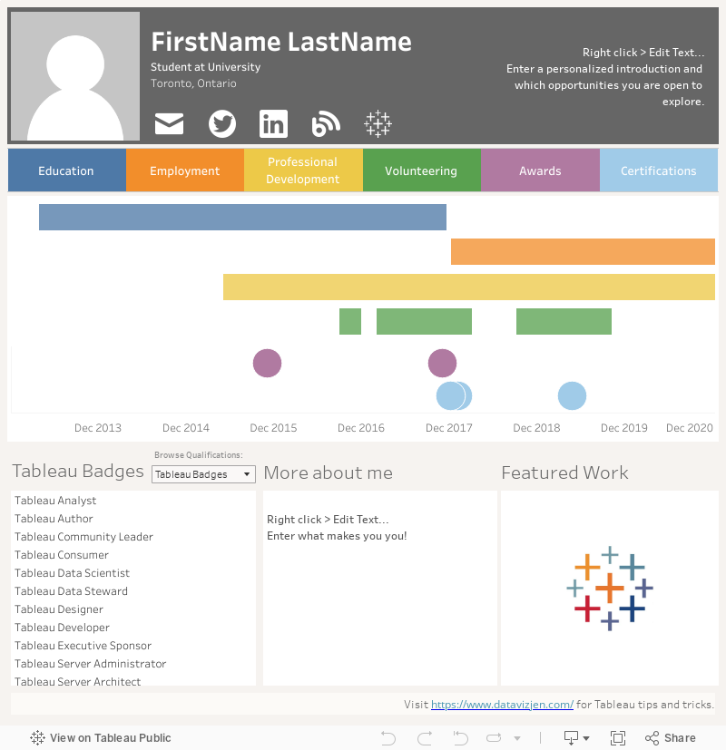
Next, let's browse the features of our resume template. Check out the
video below for a quick demo. After this video, there are instructions on how to add your data to automatically
populate the resume including your name, experience, and more!

Now that you are comfortable with the features, it is time to get to
the data.
2. Download and fill out the data source for the resume template.
Download the data template
here
on Google Drive and you may save it on your local drive.
The data source is a spreadsheet containing five tabs with a columnar
data structure - which Tableau loves.
Tab 1: Home Location - The location or residence you'd like
displayed on the resume.
Columns:
- City
- State/Province
Tab 2: Proficiency Dates - This tab has columns
used in calculated fields
(Step 7) that dynamically add how long
you've had experience with certain tools, concepts, etc. to be
displayed along with your background. Below are two
examples.
Columns:
- Date I Started Using Tableau (m/d/yyyy)
- Date I Started Data Science Research (m/d/yyyy)
Tab 3: Contact Info - Your current title or
position to be displayed, links to contact you, and a brief
overview of your background and goals.
Columns:
- Current Title
- Tableau Public URL
- Twitter URL (Make sure this is a professional account!)
- LinkedIn URL
- Blog URL
- Background (Who you are, what you're good at, and what value you bring.)
** If you do not have (or want to share links to) the above URLs,
leave the column blank and remove the icon on the Tableau dashboard.
We will cover this in Step 5. **
Tab 4: Resume Timeline - This is the data that highlights your experience
including: education, employment, professional development, awards,
certifications, and volunteer work.
Columns:
- Type - This is the category of experience for the timeline. Feel free to swap or remove these but keep the categories to a maximum of six for aesthetics.
- Organization - This is the grantor of the experience, for example, your employer.
- Title - This is the title of the position or award.
- Description - Be sure to use bullet points if highlighting multiple accomplishments.
- Location - Where the experience took place.
- Started On - What date did you start the experience?
- End Date - If still on-going, leave this blank.
- Date for Timeline - This is the date where the event will plot on your timeline. If there are two events from the same category (like awards) on the same date, we can adjust the date +/- one month (or days) to better visualize this data.
Tab 5: Skills - List the skill categories that you want to highlight. These
may include: spoken languages, technical skills like programming,
and soft skills like "attention to detail".
Columns:
- Category - Category of skill.
- Type - The name or description of the skill.
- Details - More information of the skill and why it qualifies you for a position.
- URL - You may want to provide more detail via URL for your skills. If not, leave blank.
After you are finished updating the data source to reflect your
expertise and skills and save it, it is time to connect it to
your workbook.
Open the Resume Template in Tableau Desktop (or
Public).
To the left of the "Resume Template" dashboard, there is a tab
named "Data Source" with a data source icon. Click on this
tab.

A window will appear asking, "Where is the data file?" Simply
navigate to your resume data source and open the file.
Click on the dashboard tab "Resume Template" at the bottom
left.
If using Tableau Desktop, click on Data > Refresh All
Extracts...

Click the "Refresh" button.

To refresh the data if you are using Tableau Public, first
navigate to the dashboard.
On the menu ribbon, click on
Data > Contact Info > Refresh. You may be prompted to
replace the file with your newly saved data source.
Repeat this for the other data sources (spreadsheet tabs) to
refresh your data.
*** Please go through the data sources and ensure the data
connection was changed in Tableau! ***
You should now see your data populated on the resume.
** Do events appear to be missing on your timeline? Don't
worry, we will fix this in Step 6.**
4. Replace default images.
There are default images on the resume template that you can
replace: Profile photo (both on default and mobile
layouts) and Featured Work (only on default layout).
** If you do not feel comfortable displaying your photo,
that's perfectly fine! We can delete the image in the
next step. **
To replace an image, right click and select "Edit
Image..."

Click "Choose" and select your image. Be sure to Fit and
Center for best results. You may also add a Target URL to the
image if you desire.

Toggle the Device Layout to "Phone" and replace this image as
well.

Repeat these above steps for "Featured Work" or feel free to
continue use the Tableau sparkle logo if your work is on Tableau
Public.
Be sure to add the Target URL to your Featured Work image.
5. Filter out or edit any non-applicable template features.
To better personalize your resume, there are a few tasks we
will need to address.
These may include:
- Removing the photo if applicable.
- Removing any social media icons that are not applicable.
- Writing a personalize introduction and "More About Me" section.
- Editing the Qualifications parameter if applicable.
Removing the photo.
If you would rather not have a photo on your resume, simply
remove the image from the dashboard and delete it. This will add
some space to your right tab, so adjust this to be wider.
Removing any social media icons that are not
applicable.
If you do not have or want one of the options for contact,
remove the icon worksheet from the dashboard and delete
it.
Writing a personalize introduction and "More About Me" section.
For your personalized introduction in the upper right and the
"More About Me" section in the bottom middle, simply right click
to edit the text. Be sure to keep it concise as not to run out
of room! Double check the length of the text on both the Default
and Phone Device Preview.

Editing the Qualifications parameter if applicable.
In your "Skills" data source (spreadsheet tab), you are able
to create several categories for your qualifications. For
interactivity, these categories may be toggled by a parameter
named "Select" in the Tableau workbook. If you have added
categories or changed the name of any of these categories, we
will need to Edit the Parameter.
Right click on "Select" parameter > Edit...

In this window, click on Add values from > Skills >
Category

The resume timeline is actually two worksheets. One is a
Gantt chart (bars) to visualize the duration of the
experience and the other worksheet is for a single day
event, like an award, visualized by circles.

*** Since we are using two worksheets to appear as
one it is imperative that the axes
match.***
Navigate to the "Timeline" worksheets. There are four in
total.


A window will pop up that shows the Fixed Start and Fixed
End of the Axis.
*** Choose the best start and end dates for your
timeline and ensure that they are all the same on all
four "Timeline" worksheets. ***

The Timeline (Circle) worksheets display the axis header, so
we just need to right-click to edit these.
However, when completed editing the axes on the Timeline
(Gantt) and Timeline (Gantt) (Mobile) worksheets, right click
on the axis and unselect "Show Header" shown
highlighted in blue below.

You may also need to edit the timeline visual types (Gantt
bar vs circle) to better suit your experience. Also, if any
experience types have been added or renamed in the data
column "Type" in the "Resume Timeline" data source
(spreadsheet tab), we need to Edit the Set.
Go to any Timeline worksheet and find the "Type Set
(filter)" set in the left side data window. (Sets have a
Venn diagram icon.)
Right click > Edit Set...
Select all of the Types that belong together in the Gantt
chart view. Any events that are single-date should not be
selected in this set.

This should correct any changes made in the experience Type
in the data and switch the visualization type if
required.
7. Create calculations for your proficiency dates and display them.
When adding your experience to the data, you may have added
dates to the "Proficiency Dates" tab. We will need to create
calculated fields to add the number of years of experience
they carry and display them in a tooltip on the default
layout dashboard and as text on the mobile layout
dashboard.
First, for the default layout, let's navigate to the "My
Info" worksheet that also has your name, title, and
location.
Click on the "Proficiency Dates" data source on the upper
left.
Now you should see two calculated fields already
created: "Data Science Experience" and "Tableau
Experience".

Choose one of these to duplicate (Right Click >
Duplicate) and Edit to replace with the other Proficiency
Date you'd like to add. Rename the field accordingly.

Drag the new calculation on the Tooltip button in the Marks
box. Next, click on the Tooltip button and add this
experience under the Qualifications header.

Now, navigate to the mobile layout and go to the "More
About Me (Mobile)" worksheet.
This time, drag the new calculation(s) to the Text button
on the Marks box. Click on the Text button and then ellipses
to add the new experience under "Qualifications".


8. Publish your interactive resume to Tableau Public.
Now that you have completed your resume, it's time to publish
it on Tableau Public's platform to share!
On the Menu ribbon, go to Server > Tableau Public >
Save to Tableau Public As
Rename your resume and click Save.

Viola! You now have an amazing interactive resume that will
stand out to employers and show off your data viz skills using
Tableau Software.
On the bottom right, you will see a share icon. When clicked,
you will find several options to share your
resume!

Please feel free to
contact me if you have any questions or comments.
Happy vizzing!

Comments
Post a Comment
Leave a reply