
Have you ever wanted dynamic units of measure on an axis? Look no further, this post has unlocked the workaround!
Contents: (Click to Jump to)
Step 1: Establish table calculations with dynamic units for the axis in separate worksheets.
Step 2: Combine these worksheets on a dashboard with the chart.
Step 3: Create rounded unit labels if desired.
Currently, Tableau does not support dynamic units. (Upvote the functionality request here.) Also, check out Absolutely Amazing Dynamic Units of Measure as a prerequisite for the following workaround.
Having dynamic units is common ask for users and Creators are usually able
to provide workarounds utilizing the text label in the marks box.
However, this trick will not work on a continuous axis (i.e., the axis
for a line chart). The workaround? We make our own axis labels with
multiple sheets.

Establish table calculations with dynamic units for the axis in separate worksheets.
Let's first think about how Tableau creates an axis. The range is
automatically set by a min and a max value of the values on the chart. So,
first we need to create a WINDOW_MIN() and a WINDOW_MAX() for our axis
labels. Next we find the midpoint of the axis and then the 1/4 and 3/4 points of the axis range. We will need
five calculations and worksheets for the axis labels.
Note: The average or median of the data may not necessarily be the midpoint
of the axis range.

Note:
For this trick to work properly we have to remove zero from the
axis. This can be an automatic deal breaker in certain analyses that
need to minimize bias.
Read a fun article on including/not including zero on a y-axis by
Justin Fox on
his blog
byjustinfox.com.
Because a table calculation needs all of the data on the worksheet
(table) to return the desired aggregation, we need to duplicate the chart
as many times as we have labels. (Side note: You could put all of these labels in one worksheet for the axis, but you lose control of the precise spacing of the labels for the y-axis.)
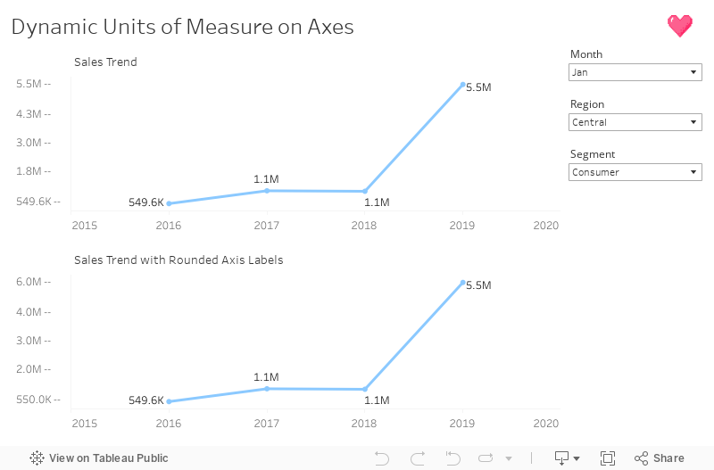
Below we have our Sales trend line. Notice how the maximum
value is 4.2 M and the minimum value is 258K, but the axis is still
formatted in M? We are going to fix that right now.

Duplicate this worksheet and create a calculation for the
WINDOW_MAX(SUM([Sales])) that is unit dynamic called "Sales Axis Max Value
and Unit". (I like to put "--" at the end of the string as a pseudo
tick-mark, but you may drop it if you'd like.)

Place this field on the rows and Compute Using > Table
(across).

Next, simply duplicate this step for the Min, Mid, 1/4, and 3/4 axis
values and units for the axis. Feel free to download the workbook above
for the pre-made calcs.
Place the chart with the axis on a dashboard and add a Vertical layout container to the left of the chart. Next, we bring in our worksheets with our axis labels. The order will go:
Blank (To pad the top of the y-axis.)
Max (I like to format vertical text alignment to top.)
3/4
Midpoint
1/4
Min (I like to format vertical text alignment to bottom.)
Blank (To pad the bottom of the y-axis if there is a date field on
the x-axis.)

Create rounded unit labels. (Optional.)
You may find that rounding the axis label values will look better on the dashboard. To do this, we can use the ROUND() function and use negative numbers to round the integer to a billions, millions, thousands, or hundreds place. Below is the Max Value as an example. For the different units of measure, we are rounding to different hundreds places. (E.g., Billions is rounded to -8 and Millions is rounded to -6.)
Note: Depending on how condensed your chart data is, you may want to experiment with more detailed rounding like to ten-thousands, etc., or even offer the
user a parameter toggle for the "unrounded" unit measures to avoid the same value on the axis labels.

And voila! We now have dynamic units of measure on our axis.


Comments
Post a Comment
Leave a reply